April 2006
The Archives
-
tourism bc
Past, Present and Future of the User Experience at Tourism BC
Jacob Nielsen, the godfather of usability recently wrote two alertboxes describing 8 stages of corporate usability. Reading these
two articles was like a trip through time. So allow me to take you on a trip through 6 years of HelloBC.com and usability, from my perspective.Stage 0: Usability is Unknown
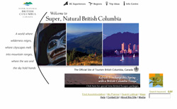 I’ve added this step because usability was simply not known. The first website at Tourism BC was launched in 2000. Although one usability test was conducted, usability wasn’t an accepted process. It was done by the web development company and none of the results were followed-up on. The website was build around the brand and most decisions were based on it. Including a navigation system that took up half the page and top level navigation with ambiguous names.
Stage 2: Developer-Centered Usability
I became involved shortly after launch as web technician (developer) and started analysing traffic patterns. I figured out that people seem to be stuck right on the homepage and concluded we had a usability issue. Testing was out of the question, I couldn’t convince people that testing with 5 people would produce actionable results so I made improvements by just analyzing the log files by trial and error (A/B testing), based on my personal judgement. When our advertising agency recommended a heuristic evaluation, and one of our research consultants compared web usability testing with putting together Ikea furniture (if you watch 5 people who can’t put it together, you don’t need to watch another 100), we moved to stage 3.Stage 3: Skunkworks Usability
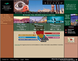
Two years after launch, we re-branded the website. This time, usability testing was part of the process. Mind you, it was at the end of the process, after the website was done and incorporating changes based on the result was difficult because the budget was gone. But nevertheless, the user gained importance although creative and brand was still front and center in the methodology. I remember a discussion with a visual designer about the use of text-on-images instead of HTML. Using test-on-images provided ‘more control’ was the argument. I hated myself for 3 years because I caved on that discussion.Stage 6: Systematic Usability Process
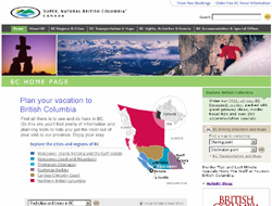 Late 2003, we realized that the ‘old’ website wouldn’t be able to meet future objectives. A new unit within Tourism BC was created to manage websites and I moved from IT to lead this unit. This gave me a chance to incorporate the new methodologies I had been learning about. We built a great team and started a journey that ultimately lead to the current website using a User Centred Design methodology. The user was front and center and brand, content and technology worked in harmony, based on meeting business objectives by aligning them with our users objectives. We build personas, conducted research and tested frequently. The budget for IA and usability was approximately 20% of the overall budget.
Stage 7: Integrated User-Centered Design
The process is now proven and we’ve made changes based on the first go-around. Usability is front and center in our process. Everybody on the web team is basing decisions with the user in mind and we conduct frequent tests. But the user experience is also considered in all technology projects for all interfaces. Our Vice President of marketing showed our personas during a presentation at a conference, the highlight of my usability evangelism at Tourism BC.Stage 8: User-Driven Corporation
This is my goal. Although I would define it a bit differently. It’s about transitioning into a Customer Driven Organization where (in our case), the Visitor Experience is the ultimate goal. Our websites, call centre and visitor centre network are integrated and geared toward delivering a world class tourism experience in BC, wrapped around personal (one-on-one) marketing. All based on a common methodology where we talk and listen to the users (visitors) of our province. Something Peter Merholz talked about at the closing plenary at this years IA Summit. -
personal
Worried about my friends in Nepal
04.26.06 | Permalink | 2 CommentsLast year, I spend a month in Nepal. I’ve met a lot of people there and I’ve stayed in contact with a few of them via email. The situation was bad back then, and I was very worried the last weeks during the protests that often ended in violence. It seems that the efforts have payed off for the Nepali. One of my friends sent us this email.
today is great day of nepal and nepales that they are able to restore democracy. it rely good nes. hope it will bring a golden morning of nepal. king has to kenck down towards the people at last.Update April 28:
Here’s an email I received today, from another friend in Nepal:See the attached image of a new neero of 21 century.
-
Internet
Clubmonaco.com’s form over function
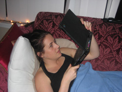 Yesterday, my wife was in spring shopping mode and started surfing her favorite stores. One of them was Club Monaco. While I was watching The Apprentice, I heard noises of dissatisfaction coming from the couch. When I looked over my wife was performing something with my laptop as you can see on the picture (I asked her to re-enact the situation). Turns out she was trying to get a closer look at the clothes and literally put the screen an inch from her face to try and get a better idea. The picture was simply too small to make sense of. “I can’t see the colour, I don’t know the material, is it smooth or ribbed?” was the answer I got after I asked what was wrong with it. There was also no way to get the costs.

So after, I went to the clubmonaco.com website to see what was going on. Turns out they have this section called “lookbook” [screenshot]. A section of the website that’s intended to get an idea of different combinations and accessories of the Spring collection (I think). You can flip through the “book” by clicking “next” and “previous”. It’s created in Flash and it’s very on brand. The design is nice and stylish, very Club Monaco.But as often the case, very on brand from a visual design perspective can be a terrible User Experience. Small photos, lack of information and no ability to further explore. My wife’s experience on the Club Monaco website was terrible, on brand or not. In fact, I think my wife’s perception of Club Monaco has changed for the worse. Definitely a bad “moment of truth”.
-
Internet
The Google Effect
Joshua Porter on the UIE blog writes about what he calls the Amazon effect. Whenever they test websites that sell stuff Amazon also sells, a user is inclined to just go to Amazon instead of using the site they’re called on to test.
I’ve seen the same effect during our usability testing. Sometimes, when we ask a user to look for a particular piece of tourism information on HelloBC.com, a user simply says “oh, let me just goto Google”, even though they are already on British Columbia’s official tourism website. We’ve been called that “the Google effect”.
In the late 90’s, the behaviour I observed was that users searched for a website they thought would contain the information they were looking for. These days, users search for the specific page on a website. They use more keywords, and more specific keywords in their search queries. They also often spend less time on a website trying to find the information if it’s not on the first page they land on. They’ll just go back to Google and try the next result.
So on HelloBC.com, we done a few thing to accommodate this behaviour. First, we’ve put a lot of effort against Search Engine Optimization. We’d like user to land on the page within our website that contains the information they’re looking for.
And second, we try to provide strong scent of information. So if a user isn’t on the exact page that contains the information, we like to present them with clear links to where the information is. A good example of this is our Sights, Activities and Events page.
-
Management
Crazy Jim
That’s how we refer to Jim McCarthy at Tourism BC. I had the chance to spend 10 minutes with Jim last year. Those were 10 very intense minutes. Jim doesn’t beat around the bush and he left me one of his hand written business cards and a DVD of a presentation he did years ago when he was still working at Microsoft. I think his approach scared a few people here so we never hired him to work on one of our projects. But after watching the DVD and reading one of his books, I would love to have the opportunity to work with him or take his BootCamp one day.
I’ve been listening to the Podcasts he hosts with his wife Michelle. Every time, a little bit of their methodology about building effective teams is revealed. I haven’t read his book Software For Your Head yet so sometimes I have no clue what they’re talking about. It’s some cryptic language around “protocols” and terminology such as “checking in”, “alignment”, “decider” and more. But I get the gist of it and I usually find something useful in there.
The best one so far was the piece about meetings and in particular about discussions because they usually don’t resolve anything and is basically a waste of time. Michelle summed it up nicely for me: “What I’ve come to notice is that lack of awareness on most people’s part is that time and energy, what is precious, is being wasted [on meetings] and the higher the number of people the more time and the more energy that is being wasted”. So meet to resolve instead of instead of meet to discuss would be my summary without all the crypto talk.
If there’s one thing I’ve learned over the years is that the most important aspect of a successful project is having an effective project team. That means smart, competent, committed team members that share a vision, work toward that vision, help each other and have fun in the process. I believe if you achieve this, everything else flows out of it. So if you’re working with teams, listing to Jim and Michelle will definitely provide you with some ideas around creating effective teams.
-
tourism bc, Travel & Tourism
Travelers need for Insider Information
The internet is allowing planners to increase the awareness opportunities through word-of-mouth dramatically. Email and websites such as blogs are a great way to stay connected with loved ones.
Word of mouth is the most important source for destination awareness. Most trip ideas start by talking to friends and family about their trips or the desire to visit a friend or family member. Beside the official information, travelers consume information from a number of other sources of information while planning their trip. Word of mouth is the most important one.
The internet allows travel planners to meet the need for this information in new ways. The thorntree message board on the lonely planet website was one of the first places where travel planners would meet to discuss their trip plans. Since then, numerous websites have been created where users can write their travel stories, rate hotels and attractions, submit pictures and manage a travel guide collectively. Each of these websites either assist in creating destination awareness or assist in trip planning.
At Tourism British Columbia, we’ve learned through our focus group and usability research that travelers expect us to provide the official information but also ‘insider information’. This is the information only locals know; that cute little coffee-shop, a hidden hiking trail, a pub kayakers go to after their activities.
So about six months ago we started HelloBCBlogs.com, a blog site where a group of our staff can write about anything related to travel in BC. Most stories were related to personal tourism experiences from our staff members. But there are also tips travelers can use in their trip planning. The website was a success almost immediately with high visitation and a very high repeat visitation rate. So we knew we hit on something good.
Just a few weeks ago, we expanded our blog authors to include the staff of our Visitor Centres. There are over 110 Visitor Centres located throughout British Columbia, managed primarily by the communities and often with the help of volunteers who are passionate about their community and are also the local experts. So we invited them to join our blog and write about their communities to extend the information beyond the Tourism BC staff and provide the consumers with even more insider information. We’ve just started but I’ve already read some great entries. -
Travel & Tourism
“Call Us for our internet Rate”
OK this is funny. I’m researching some hotel websites in Vancouver and I come a cross the promotion below. I have to call to get the special internet rate.

-
Internet
Thank you Google
04.09.06 | Permalink | 4 CommentsWell, what do you know? Only a few days after I complained on my blog last week about not receiving an invitation to Google Analytics, guess what I found in my inbox…an invitation code! I’ve installed it on the MealMe.com website and so far it’s looking impressive. When I’ve had a few weeks of experience I’ll write a little review.
-
personal, tourism bc
Two Days in Beverly Hills
04.07.06 | Permalink | Comments Off on Two Days in Beverly Hills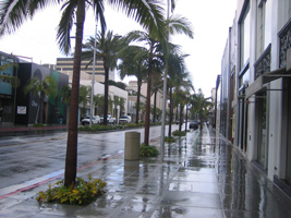
I spent two days in Beverly Hills this week. I was invited on a panel at the Canada Media Marketplace to share some of our blogging experience on HelloBCBlogs.com. It was my fist stay in LA and beside the fact that it was raining, I noticed that a large number of people were walking/driving around with a blue-tooth device clipped at their ear that connects to their cell phone. I also found it strange that there were virtually no shoppers on Rodeo drive, although the weather might have had something to do with it.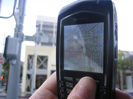
Visiting a new city also gave me a chance to test Google Local for mobiles. Bell gave me a Blackberry 7130e with EVDO capabilities to try out for a few weeks. So I used the driving directions to walk from my hotel to to the conference. Very nice. When they manage to connect it with GPS or another location service, it’s a killer app. I also tried to post a blog while sitting in a Thai restaurant. It took me 20 minutes to type an entry only to realize that it wouldn’t save because of a browser limitation.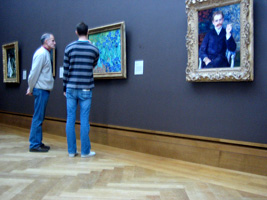
On the second day I had a few hours before heading back to Vancouver so I visited the Getty Centre. I was very impressed with the architecture of the building and gardens and their art collection of classic European art is very impressive. Any day I can see a van Gogh is a good day. It’s funny how a lot of people I talk to tell me they like the gardens as much as the art. I’m sorry but no garden can ever beat looking at a van Gogh, a Renoir, a Cézanne, a Manet, a Degas, a Monet or Millet.


