Jacob Nielsen, the godfather of usability recently wrote two alertboxes describing 8 stages of corporate usability. Reading these
two articles was like a trip through time. So allow me to take you on a trip through 6 years of HelloBC.com and usability, from my perspective.
Stage 0: Usability is Unknown
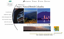
 I’ve added this step because usability was simply not known. The first website at Tourism BC was launched in 2000. Although one usability test was conducted, usability wasn’t an accepted process. It was done by the web development company and none of the results were followed-up on. The website was build around the brand and most decisions were based on it. Including a navigation system that took up half the page and top level navigation with ambiguous names.
Stage 2: Developer-Centered Usability
I became involved shortly after launch as web technician (developer) and started analysing traffic patterns. I figured out that people seem to be stuck right on the homepage and concluded we had a usability issue. Testing was out of the question, I couldn’t convince people that testing with 5 people would produce actionable results so I made improvements by just analyzing the log files by trial and error (A/B testing), based on my personal judgement. When our advertising agency recommended a heuristic evaluation, and one of our research consultants compared web usability testing with putting together Ikea furniture (if you watch 5 people who can’t put it together, you don’t need to watch another 100), we moved to stage 3.
Stage 3: Skunkworks Usability

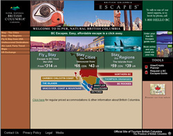
Two years after launch, we re-branded the website. This time, usability testing was part of the process. Mind you, it was at the end of the process, after the website was done and incorporating changes based on the result was difficult because the budget was gone. But nevertheless, the user gained importance although creative and brand was still front and center in the methodology. I remember a discussion with a visual designer about the use of text-on-images instead of HTML. Using test-on-images provided ‘more control’ was the argument. I hated myself for 3 years because I caved on that discussion.
Stage 6: Systematic Usability Process
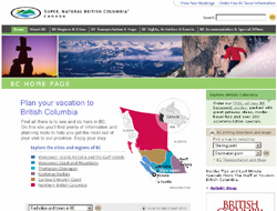
 Late 2003, we realized that the ‘old’ website wouldn’t be able to meet future objectives. A new unit within Tourism BC was created to manage websites and I moved from IT to lead this unit. This gave me a chance to incorporate the new methodologies I had been learning about. We built a great team and started a journey that ultimately lead to the current website using a User Centred Design methodology. The user was front and center and brand, content and technology worked in harmony, based on meeting business objectives by aligning them with our users objectives. We build personas, conducted research and tested frequently. The budget for IA and usability was approximately 20% of the overall budget.
Stage 7: Integrated User-Centered Design
The process is now proven and we’ve made changes based on the first go-around. Usability is front and center in our process. Everybody on the web team is basing decisions with the user in mind and we conduct frequent tests. But the user experience is also considered in all technology projects for all interfaces. Our Vice President of marketing showed our personas during a presentation at a conference, the highlight of my usability evangelism at Tourism BC.
Stage 8: User-Driven Corporation
This is my goal. Although I would define it a bit differently. It’s about transitioning into a Customer Driven Organization where (in our case), the Visitor Experience is the ultimate goal. Our websites, call centre and visitor centre network are integrated and geared toward delivering a world class tourism experience in BC, wrapped around personal (one-on-one) marketing. All based on a common methodology where we talk and listen to the users (visitors) of our province. Something Peter Merholz talked about at the closing plenary at this years IA Summit.

