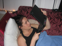
 Yesterday, my wife was in spring shopping mode and started surfing her favorite stores. One of them was Club Monaco. While I was watching The Apprentice, I heard noises of dissatisfaction coming from the couch. When I looked over my wife was performing something with my laptop as you can see on the picture (I asked her to re-enact the situation). Turns out she was trying to get a closer look at the clothes and literally put the screen an inch from her face to try and get a better idea. The picture was simply too small to make sense of. “I can’t see the colour, I don’t know the material, is it smooth or ribbed?” was the answer I got after I asked what was wrong with it. There was also no way to get the costs.

So after, I went to the clubmonaco.com website to see what was going on. Turns out they have this section called “lookbook” [screenshot]. A section of the website that’s intended to get an idea of different combinations and accessories of the Spring collection (I think). You can flip through the “book” by clicking “next” and “previous”. It’s created in Flash and it’s very on brand. The design is nice and stylish, very Club Monaco.
But as often the case, very on brand from a visual design perspective can be a terrible User Experience. Small photos, lack of information and no ability to further explore. My wife’s experience on the Club Monaco website was terrible, on brand or not. In fact, I think my wife’s perception of Club Monaco has changed for the worse. Definitely a bad “moment of truth”.

